
Figma Design: The Complete Guide to Professional UI/UX Design for Websites & Apps
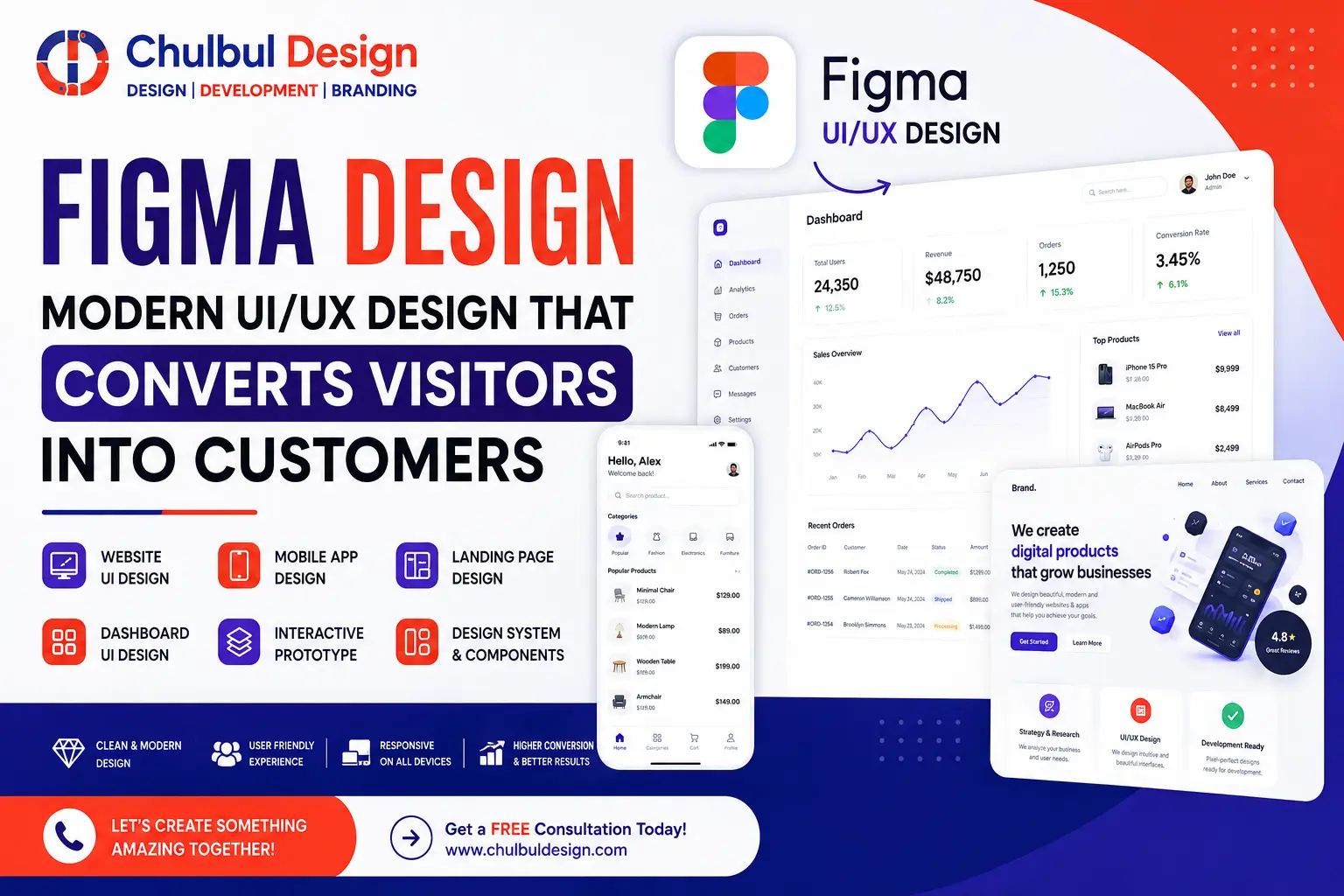
Understanding the Importance of Modern UI/UX Design
Your website is essentially your digital storefront, and its user interface (UI) plays a critical role in determining whether visitors will stay and engage with your content or leave due to frustration. Every second count, and delays or confusion can lead to losing potential customers. This is why businesses are increasingly turning to Figma design, the industry standard for creating interfaces that are both aesthetically pleasing and optimized for conversion.
In today's digital landscape, having a well-designed UI/UX is no longer a luxury but a necessity. It's about creating an experience that is not only visually appealing but also intuitive and easy to navigate. This guide will delve into the world of Figma UI/UX services, exploring how they can transform your digital presence, boost your search engine optimization (SEO), and ultimately turn visitors into loyal clients.
Whether you're a startup looking to make a mark, a SaaS company aiming to simplify user interactions, or an enterprise seeking to enhance its digital footprint, understanding the principles of modern UI/UX design is crucial. It's about crafting an experience that resonates with your audience, builds trust, and encourages engagement.
What is Figma and How Does it Fit into Modern UI/UX Design?
Figma is a cloud-based UI/UX design tool that has revolutionized the way teams create, prototype, and collaborate on design projects in real-time. Unlike traditional design software, Figma is accessible directly in the browser, with the option of a desktop app, making it universally accessible across different platforms. It has become the go-to choice for website UI design, mobile app UI design, and dashboard UI design due to its versatility and collaborative features.
With Figma, designers have the capability to build wireframes, high-fidelity mockups, and interactive prototypes, all while ensuring that developers are kept in the loop through its seamless developer handoff features. This integration enables a smoother transition from design to development, reducing miscommunications and speeding up the overall project timeline.
Figma's real-time collaboration feature is particularly noteworthy, allowing multiple stakeholders to review, comment, and edit designs simultaneously. This feature is invaluable for teams working on complex projects that require input from various disciplines, ensuring that everyone is on the same page and that the final product meets all the necessary criteria.
Figma vs Adobe XD: A Comparative Analysis
| Feature | Figma | Adobe XD |
|---|---|---|
| Real-time collaboration | ✅ Native | ⚠️ Limited (via cloud) |
| Browser-based | ✅ Yes | ❌ Desktop only |
| Plugin ecosystem | ✅ Rich | ✅ Moderate |
| Version control | ✅ Built-in | ❌ Manual |
| Developer handoff | ✅ Seamless | ✅ Good |
| Cost | Free tier + affordable | Subscription-based |
The comparison between Figma and Adobe XD highlights the strengths of Figma in terms of real-time collaboration, browser-based accessibility, and cost-effectiveness. While Adobe XD offers robust features, Figma's collaborative nature and seamless developer handoff make it a superior choice for teams and agencies working on complex UI/UX projects.
Why Businesses are Embracing Figma for UI/UX Design
- Speed: Figma enables faster design, prototyping, and iteration, allowing businesses to quickly respond to market changes and user feedback.
- Collaboration: Multiple stakeholders can review and comment in real-time, enhancing communication and reducing project timelines.
- Consistency: Utilizing design systems and component libraries ensures brand uniformity across all platforms and products.
- Scalability: Figma grows with businesses, from startup to enterprise, adapting to the evolving needs of the organization.
- Developer-friendly: Seamless handoff with CSS, Swift, and Android code snippets streamlines the development process, reducing errors and saving time.
These benefits underscore why Figma has become the preferred choice for businesses seeking to elevate their digital presence through modern UI/UX design. By addressing the needs of both designers and developers, Figma facilitates a more efficient and effective design process.
The Value of Professional UI Design in Conversion and User Experience
Great UI design extends beyond aesthetics; it's fundamentally about usability and trust. A well-designed interface reduces cognitive load, guides users intuitively, and builds credibility, all of which are critical for conversion. The statistics are telling: 94% of first impressions are design-related, and consistent UI reinforces brand identity, leading to better user retention and a competitive edge.
- First impressions: 94% of first impressions are design-related, making UI a critical factor in initial engagement.
- Brand perception: Consistent UI reinforces your brand identity, contributing to recognition and loyalty.
- User retention: Intuitive interfaces keep users engaged, reducing bounce rates and increasing the likelihood of conversion.
- Competitive edge: Standing out in crowded markets often comes down to the quality of user experience, with well-designed UI providing a significant advantage.
The impact of UI design on user experience and conversion rates cannot be overstated. It's about creating an environment that welcomes users, guides them through their journey, and encourages them to take the desired actions, whether that's making a purchase, signing up for a service, or engaging with content.
The Power of Great UX Design in Enhancing User Engagement
UX design focuses on the overall experience, aiming to create a seamless, intuitive, and enjoyable interaction between the user and the product. When users enjoy using your product, they are more likely to stay longer, convert more frequently, and become advocates for your brand. The benefits of great UX design include reduced friction in user journeys, higher conversion rates, lower support costs, and positive word-of-mouth.
- Reduced friction in user journeys leads to higher satisfaction and engagement.
- Higher conversion rates, with some studies indicating up to a 400% increase, can be achieved through optimized UX design.
- Lower support costs result from intuitive designs that minimize user confusion and errors.
- Positive word-of-mouth is a powerful marketing tool, driven by exceptional user experiences.
Great UX design is not just about fixing problems but about creating opportunities for engagement, conversion, and brand loyalty. It requires a deep understanding of user needs, behaviors, and motivations, as well as the ability to craft experiences that meet these needs in a seamless and intuitive manner.
Differentiating Between UI and UX: Understanding the Interplay
UI (User Interface) refers to the visual elements of a product or system, such as buttons, icons, typography, and colors. It's the "look" of the product. On the other hand, UX (User Experience) encompasses the overall feel, flow, and ease of use, focusing on how the product interacts with the user and the quality of that interaction. It's the "feel" of the product.
A simple analogy to understand the difference is to consider a restaurant. The UI would be the menu, the decor, and the physical appearance of the restaurant, while the UX would be the experience of dining there, including the service, the ease of ordering, and the overall ambiance. Both are crucial for a satisfying experience, just as both UI and UX are essential for a product's success.
The Necessity of UI/UX for Every Business, Including B2B
Every business, regardless of whether it operates in the B2B or B2C sphere, is ultimately a human business. The usability and user experience of software, websites, or apps directly impact productivity, efficiency, and ultimately, the bottom line. UX design services are crucial in ensuring that products are intuitive, thereby reducing training costs, enhancing user adoption, and boosting overall business performance.
In the B2B context, where complexity and customization are often higher, the role of UI/UX becomes even more critical. It's about simplifying the complex, making the intimidating accessible, and ensuring that the user experience supports the business goals of both the company and its clients.
The Role of Figma in Website UI Design and Beyond
Figma's capabilities extend across various design needs, from website UI design to mobile app design, dashboard UI design, and SaaS product design. Its flexibility and feature set make it an ideal tool for crafting responsive, accessible, and engaging digital experiences. Whether you're designing an e-commerce site, a corporate website, or a complex SaaS application, Figma provides the tools and functionalities to bring your vision to life.
Responsive UI Design: The Cornerstone of Modern Digital Experiences
Responsive design is no longer a luxury but a necessity in today's multi-device world. Figma's auto-layout and constraints features ensure that your designs adapt gracefully to any screen size, providing an optimal user experience across desktops, tablets, and mobile devices. This adaptability is critical for maintaining engagement, as users expect a seamless experience regardless of how they access your digital products.
Design Systems and Component Libraries: The Keys to Consistency
A design system is essentially a library of reusable components, colors, and typography that ensures consistency across products and platforms. Figma's component library and design tokens are invaluable for maintaining this consistency, allowing designers to work efficiently while ensuring that the brand's visual identity remains intact across all touchpoints.
Wireframes, High-Fidelity Mockups, and Interactive Prototypes: The Design Process
The design process in Figma involves several stages, starting from low-fidelity wireframes that help validate the structure and layout, to high-fidelity mockups that add visual detail and realism, and finally, to interactive prototypes that simulate the actual user experience. Each stage is crucial, providing a comprehensive approach to design that ensures the final product meets user needs and expectations.
Developer Handoff and the Importance of Seamless Collaboration
Figma simplifies the developer handoff process, allowing developers to inspect layers, export assets, and copy code snippets directly from the design files. This seamless collaboration is essential for reducing misunderstandings, saving time, and ensuring that the final product accurately reflects the design intent.
The Design Process: From Research to Handoff
- User Research: Understanding your audience's needs and preferences is the foundation of successful UI/UX design.
- Competitor Analysis: Analyzing what works and what doesn't in your competitors' designs can provide valuable insights and inspiration.
- Information Architecture: Structuring content logically is crucial for usability and findability.
- User Flow: Mapping the user's journey helps in identifying pain points and areas for improvement.
- Wireframing: Sketching the layout and basic functionality of the product.
- Visual Design: Applying the brand's visual identity to create an engaging and consistent design.
- Prototype Testing: Validating the design with real users to gather feedback and iterate.
- Design Handoff: Delivering the final design to developers, ensuring a smooth transition from design to development.
This comprehensive process underscores the complexity and depth of UI/UX design, highlighting the need for a structured approach that considers all aspects of the user experience.
Figma's Impact on Conversion Rates and SEO
Figma's ability to facilitate rapid prototyping and user testing allows businesses to identify and address friction points early in the design process. This streamlined approach directly correlates with higher conversion rates, as users are more likely to engage with and convert on well-designed, intuitive interfaces. Moreover, a clean, fast, and accessible UI reduces bounce rates and increases dwell time, both of which are positive signals for search engine optimization (SEO), further enhancing a website's visibility and reach.
Avoiding Common UI Design Mistakes
- Cluttered layouts can be avoided by using white space effectively, guiding the user's attention and reducing cognitive load.
- Poor contrast can be mitigated by ensuring accessibility standards are met, making the product usable by the widest possible audience.
- Inconsistent branding can be prevented by using a design system, maintaining a consistent visual identity across all products and platforms.
- Ignoring mobile responsiveness can be costly, as it's essential to design with mobile in mind from the outset, given the prevalence of mobile devices in today's digital landscape.
Being aware of these common pitfalls and taking proactive steps to avoid them is crucial for creating UI designs that engage, convert, and retain users.
Figma Best Practices for Effective UI/UX Design
- Utilizing auto-layout for responsive components ensures that designs adapt well to different screen sizes and devices.
- Creating component libraries for reuse promotes consistency and efficiency in the design process.
- Leveraging design tokens ensures that design elements are consistent and easily manageable across the product.
- Naming layers clearly is essential for a smooth handoff to developers, reducing confusion and saving time.
- Using version control to track changes is vital for collaboration and maintaining a record of design iterations and decisions.
Adhering to these best practices can significantly enhance the effectiveness of your UI/UX design efforts, leading to better outcomes for both your business and your users.
Latest UI Design Trends
When it comes to creating visually appealing and user-friendly interfaces, staying on top of the latest UI design trends is crucial. Some of the most notable trends include:
- Dark mode — reducing eye strain and saving battery life by using a darker color scheme. This trend has been increasingly popular, with many users opting for the darker theme to reduce eye fatigue caused by prolonged screen time.
- Micro-interactions — delighting users with subtle animations that provide feedback and enhance the overall user experience. These interactions can be as simple as a button changing color when hovered over or a loading animation that provides a sense of progression.
- Glassmorphism — achieving a modern and sleek look by incorporating a frosted glass effect into the design. This trend involves using blurred backgrounds, subtle gradients, and soft colors to create a sense of depth and visual interest.
- 3D elements — adding depth and visual appeal to interfaces by incorporating three-dimensional elements. These can include anything from simple shapes to complex models, and can be used to create a sense of immersion and engagement.
These trends are not only visually appealing but also provide a range of benefits, from improved user experience to increased engagement and conversion rates. By incorporating these trends into your design, you can create a modern and effective interface that meets the needs of your users.
Accessibility in Figma
Designing for accessibility is a critical aspect of creating inclusive and user-friendly interfaces. Figma provides a range of tools and features that make it easy to design for accessibility, including:
- Contrast checkers — ensuring that the color scheme is accessible to users with visual impairments by checking the contrast between different elements.
- Semantic HTML structures — using HTML structures that provide meaning and context to the content, making it easier for screen readers and other assistive technologies to interpret.
- ARIA labels — providing additional information about the content and functionality of the interface, making it easier for users with disabilities to navigate and interact with the interface.
Figma plugins can also be used to audit accessibility and identify areas for improvement. By designing for accessibility, you can ensure that your interface is inclusive and usable by everyone, regardless of their abilities.
Dark Mode
Figma supports design for dark mode, making it easy to create interfaces that are optimized for use in low-light environments. By using color variables and component states, designers can create a dark mode version of their interface that is consistent and visually appealing.
Dark mode is not only a popular trend but also provides a range of benefits, from reducing eye strain to saving battery life. By incorporating dark mode into your design, you can create an interface that is modern, sleek, and user-friendly.
Micro-Interactions
Micro-interactions are small animations that provide feedback and enhance the overall user experience. These interactions can be used to create a sense of delight and engagement, and can be as simple as a button changing color when hovered over or a loading animation that provides a sense of progression.
Micro-interactions are an effective way to provide feedback and guidance to users, and can be used to create a sense of flow and continuity. By incorporating micro-interactions into your design, you can create an interface that is intuitive, engaging, and user-friendly.
Auto-Layout & Design Tokens
Auto-layout is a feature in Figma that makes it easy to create responsive designs. By using auto-layout, designers can create interfaces that adapt to different screen sizes and devices, without having to manually adjust the layout.
Design tokens are variables that store design decisions, such as colors, fonts, and spacing. These tokens can be used to create a consistent design language, and can be easily updated and managed across the entire interface.
By using auto-layout and design tokens, designers can create interfaces that are consistent, responsive, and easy to maintain. These features are essential for creating modern and effective interfaces that meet the needs of users.
Team Collaboration & Version Control
Figma's cloud-based nature makes it easy for teams to collaborate and work together on design projects. With real-time collaboration, teams can work simultaneously on the same project, without having to worry about version control or conflicts.
Figma's version history also allows designers to revert to any previous version of the design, making it easy to track changes and iterate on the design. This feature is essential for teams that need to work together on complex design projects.
Why Startups Love Figma
Startups love Figma for its speed and affordability. With Figma, startups can quickly and easily create prototypes and test them with users, without having to invest in expensive design software or hire a team of designers.
Figma's cloud-based nature also makes it easy for startups to collaborate with team members and stakeholders, regardless of their location. This feature is essential for startups that need to move quickly and iterate on their design.
Why Agencies Use Figma
Agencies love Figma for its client collaboration, seamless handoffs, and ability to manage multiple projects. With Figma, agencies can easily collaborate with clients and stakeholders, and provide them with real-time updates and feedback.
Figma's design system and component library also make it easy for agencies to create consistent and reusable designs, which can be used across multiple projects and clients. This feature is essential for agencies that need to manage multiple projects and clients simultaneously.
How Chulbul Design Creates Figma Designs
Chulbul Design combines 15+ years of UX strategy with Figma's capabilities to create effective and user-friendly interfaces. The design process involves:
- Discover — understanding the client's needs and goals, and identifying the target audience and their needs.
- Research — conducting user research and analysis to inform the design decisions.
- Wireframe — creating low-fidelity wireframes to outline the structure and functionality of the interface.
- Design — creating high-fidelity designs that are visually appealing and user-friendly.
- Prototype — creating interactive prototypes to test and iterate on the design.
- Test — conducting user testing and feedback to validate the design decisions.
- Deliver — delivering the final design and iterating on it based on user feedback.
Every pixel is intentional, and every interaction is crafted for conversion. By following this design process, Chulbul Design can create interfaces that are effective, user-friendly, and meet the needs of clients and their users.
Case Study: FinTech Dashboard Redesign
A financial SaaS company approached Chulbul Design with a dated dashboard that was causing user frustration and confusion. The design team re-architected the information hierarchy, simplified navigation, and introduced a clean UI in Figma.
The result was a 45% decrease in support tickets and a 28% increase in daily active users. This case study demonstrates the effectiveness of Chulbul Design's design process and the importance of creating user-friendly and intuitive interfaces.
Figma vs Sketch
| Figma | Sketch |
|---|---|
| Real-time collaboration | Limited |
| Browser-based | Mac-only |
| Free tier | Paid |
Figma offers a range of benefits over Sketch, including real-time collaboration, browser-based access, and a free tier. These features make Figma an ideal choice for teams and individuals who need to collaborate and create designs quickly and easily.
DIY Design vs Professional Figma Design
| DIY | Professional |
|---|---|
| Time-consuming | Faster, expert-led |
| Inconsistent | Cohesive design system |
| Lower conversion | Optimized for conversion |
While DIY design may seem like a cost-effective option, it can be time-consuming and may not result in a cohesive or effective design. Professional Figma design, on the other hand, offers a range of benefits, including faster design, expert-led design, and optimized conversion rates.
Good UI vs Poor UI
| Good UI | Poor UI |
|---|---|
| High engagement | High bounce rate |
| Trustworthy | Unprofessional look |
| Easy navigation | Confusing flows |
A good UI is essential for creating a positive user experience and driving engagement. A poor UI, on the other hand, can result in high bounce rates, low engagement, and a negative perception of the brand.
Website UI Checklist
- Consistent typography
- Clear CTAs
- Mobile-responsive
- Fast load times
- Accessible contrast
- Simple navigation
- Prominent search function
- Clear and concise content
A website UI checklist is essential for ensuring that the design is effective, user-friendly, and meets the needs of users. By following this checklist, designers can create a website that is engaging, easy to navigate, and optimized for conversion.
Landing Page Checklist
- Hero section with value prop
- Single, clear CTA
- Social proof
- Minimal distractions
- Mobile-optimized
- Clear and concise headline
- Relevant and high-quality images
- Trust badges and security indicators
A landing page checklist is essential for ensuring that the design is effective, user-friendly, and optimized for conversion. By following this checklist, designers can create a landing page that is engaging, easy to navigate, and drives results.
App Design Checklist
- Intuitive onboarding
- Consistent navigation
- Feedback on actions
- Offline support
- Platform-specific patterns
- Simple and intuitive UI
- Fast and responsive interactions
- Personalization and customization options
An app design checklist is essential for ensuring that the design is effective, user-friendly, and meets the needs of users. By following this checklist, designers can create an app that is engaging, easy to navigate, and optimized for conversion.
UX Audit Checklist
- User journey mapping
- Usability testing
- Error handling
- Performance metrics
- Competitor benchmarks
- Heuristic evaluation
- A/B testing
- Accessibility testing
A UX audit checklist is essential for ensuring that the design is effective, user-friendly, and meets the needs of users. By following this checklist, designers can identify areas for improvement and create a design that is optimized for conversion and user engagement.
For expert Figma design services, consider reaching out to Chulbul Design, a premium web design agency with 15+ years of experience in UX strategy and design.
Frequently Asked Questions
What is Figma?
Figma is a cloud-based UI/UX design tool for creating interfaces and prototypes collaboratively.
What are the benefits of using Figma?
The benefits of using Figma include real-time collaboration, browser-based access, and a free tier, making it an ideal choice for teams and individuals who need to collaborate and create designs quickly and easily.
How can I get started with Figma?
To get started with Figma, simply sign up for a free account and start creating your design. You can also explore Figma's tutorials and documentation to learn more about its features and capabilities.
What is the difference between UI and UX?
UI refers to the visual interface, while UX refers to the overall experience and usability of the interface.